
The Shape of It
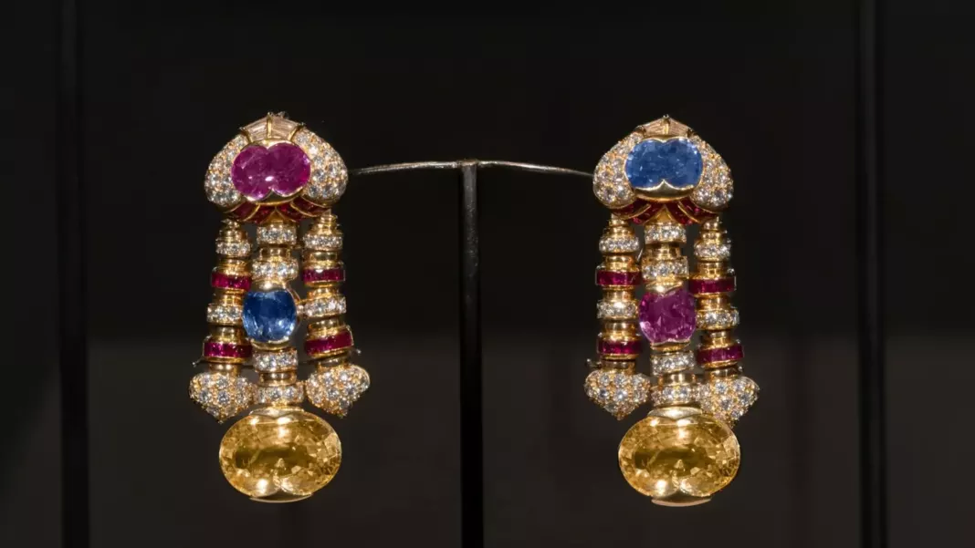
- Over 300 pieces spanning High Jewellery one-of-a-kind creations, archival Heritage Collection designs, and private loans make this the most comprehensive public survey of Bvlgari’s chromatic identity to date, running at China’s first public contemporary art museum from 5 September to 31 October 2026.
- The exhibition unfolds across three sequential chapters: the physical science of colour, the cultural symbolism of colour, and the transformative behaviour of light on gold and gemstones.
- Scenography is by Pritzker Prize-winning studio SANAA alongside Italian design studio Formafantasma, producing an environment where architecture and material form part of the exhibition rather than merely containing it.
- Two site-specific commissions by Chinese contemporary artists Liang Manqi and Zhang Ding place Bvlgari‘s Roman chromatic vocabulary in direct dialogue with Chinese artistic tradition.
Design & Exhibition Architecture
Three sequential chapters structure the visitor’s encounter with colour, moving from scientific phenomenon through cultural symbol to the raw behaviour of light.
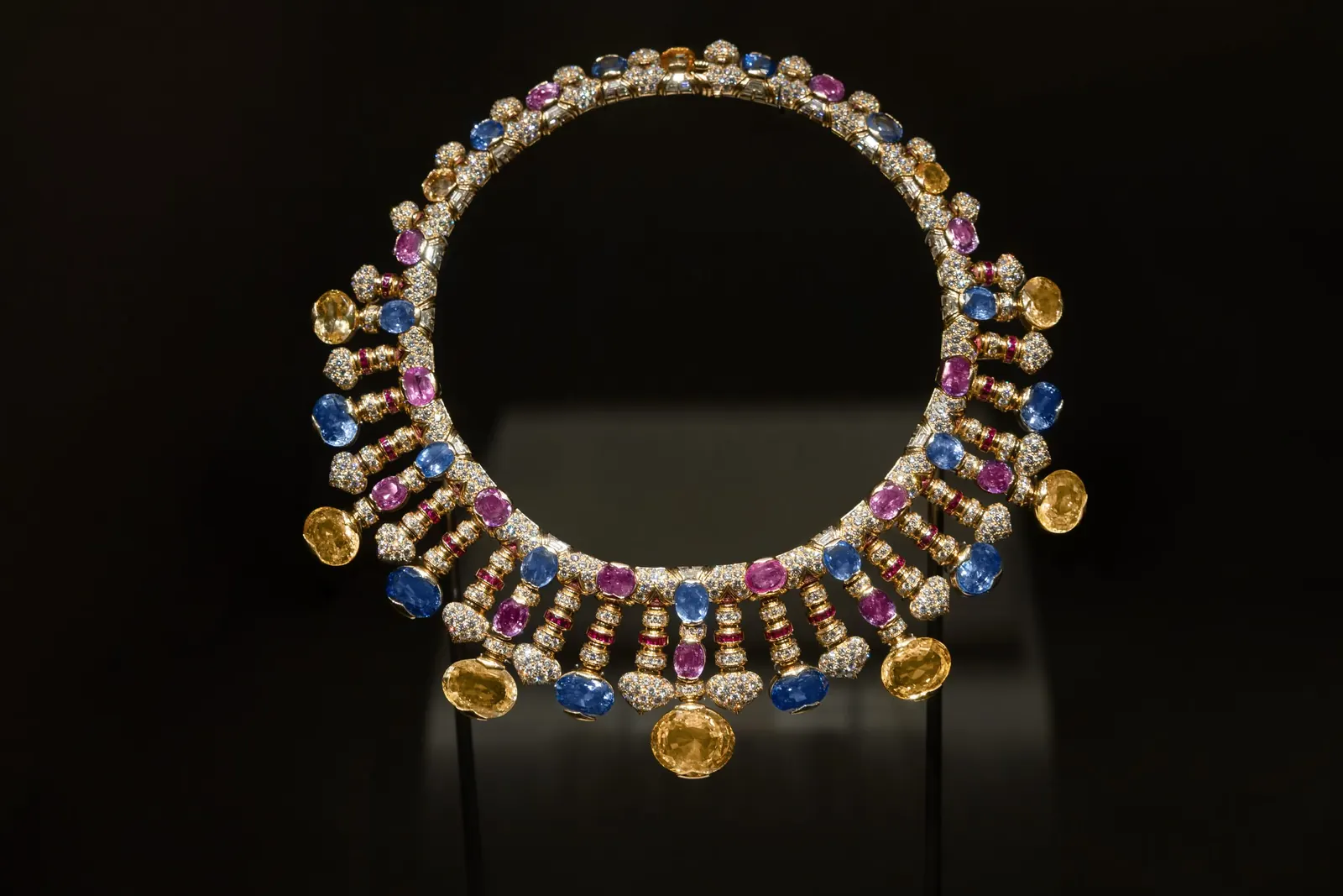
Chapter I treats colour as physics: how rubies, emeralds, sapphires, and Bvlgari’s broader palette of semi-precious stones interact with light at the molecular level. Chapter II places Western colour theory alongside the Chinese Five Elements framework, Wu Xing, where wood, fire, earth, metal, and water carry specific chromatic associations — green, red, yellow, white, and black respectively. The juxtaposition clarifies something important: red, which carries connotations of passion and danger in Western contexts, carries prosperity and good fortune in China. Bvlgari’s jewellery, circulating across both worlds, must address both registers simultaneously. Chapter III, the exhibition’s climax, demonstrates how the same stone reads differently under natural daylight, warm incandescent light, and museum fluorescence.
Heritage & Lineage
Bvlgari’s chromatic identity has a precise historical origin.
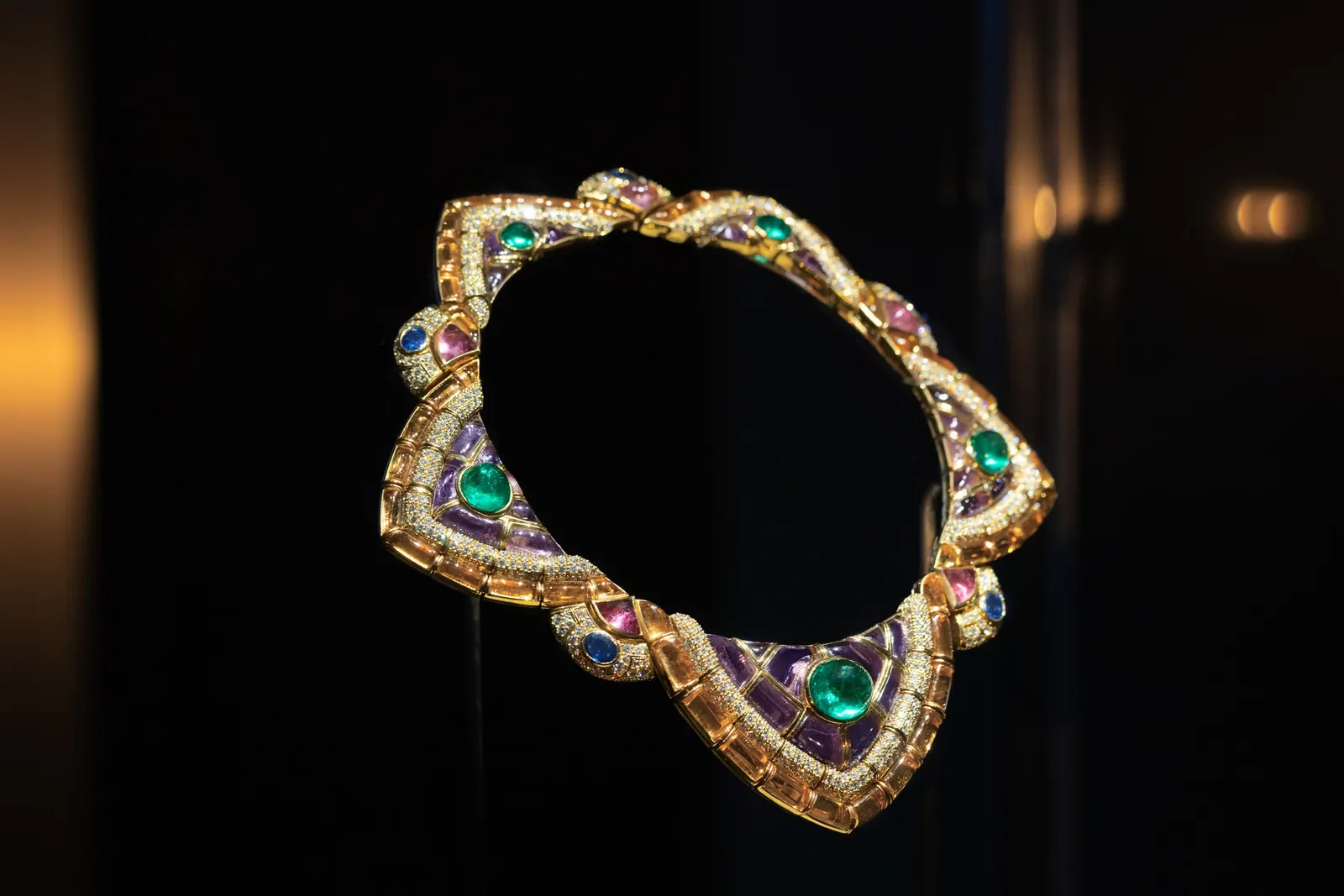
During the Second World War, platinum was requisitioned for military use. Parisian haute joaillerie houses returned to it afterwards; Bvlgari did not. The Roman Maison kept yellow gold, and Heritage Curator Director Gislain Aucremanne has described the consequence directly: yellow gold “looks best when paired with coloured gems.” Where French houses gravitated toward white diamonds in platinum settings, Bvlgari built its vocabulary around rubies, emeralds, and sapphires, but also the semi-precious stones those houses had largely dismissed: amethyst, topaz, garnet, rubellite, turquoise, coral, and lapis lazuli. A 1973 sautoir from the Heritage Collection is among the highlighted archival pieces here, demonstrating the chromatic daring of Bvlgari’s most adventurous period. Aucremanne has described the outcome of that post-war decision as “a proper language of its own.”
The Exhibition in Context
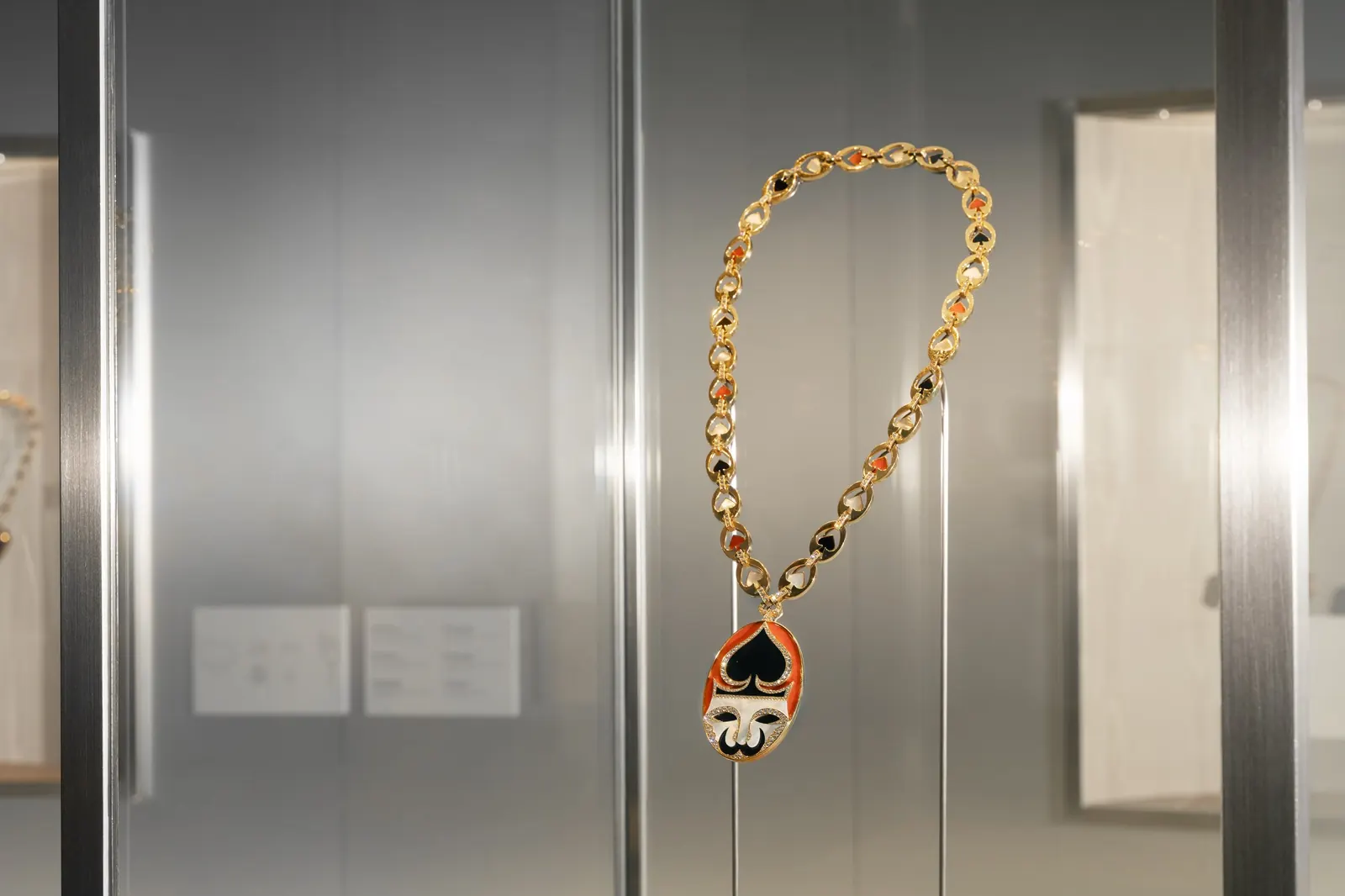
Kaleidos first appeared in Tokyo in 2025; the Shanghai edition goes further by commissioning new work specifically rooted in Chinese cultural practice.
Liang Manqi’s “Portal” installation occupies both the Power Station of Art and the entrance of the Bvlgari Hotel Shanghai, extending the exhibition’s chromatic logic beyond the museum walls. Zhang Ding’s immersive installation translates Bvlgari’s obsessions into a contemporary Chinese visual vocabulary, creating what the exhibition literature describes as a space where Rome and China, heritage and contemporary culture, momentarily occupy the same spectrum. CEO Laura Burdese has articulated the ambition clearly: “At Bvlgari, colour has always been a universal language transcending borders, cultures and time. With the Shanghai chapter of Kaleidos, we are honoured to continue this journey, this time through a dialogue with China’s rich cultural heritage and artistic expression.”
Beyond the Power Station of Art, master chocolatier Gianluca Fusto has created a limited-edition collection of Kaleidos-inspired chocolates for Bvlgari Dolci, translating the exhibition’s ideas about colour and craft into what one publication described as “an edible epilogue.”
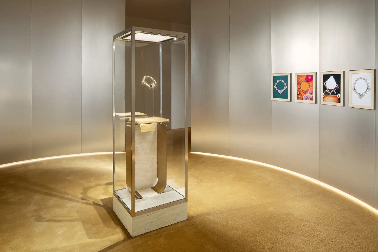
For collectors and jewellery specialists across the Gulf attending Watches and Wonders and tracking Bvlgari’s global exhibition programme, Kaleidos Shanghai represents the most fully developed iteration of the project to date. Full visitor information is available at bulgari.com.
Stay ahead of the latest releases. Subscribe to our newsletter for editor-curated coverage of luxury timepieces across the Middle East.
Frequently Asked Questions
Where and when is the Bvlgari Kaleidos exhibition taking place in Shanghai?
Bvlgari Kaleidos: Colors, Cultures and Crafts runs at the Power Station of Art in Shanghai from 5 September to 31 October 2026. The Power Station of Art is China's first public contemporary art museum.
How many pieces are on display at Bvlgari Kaleidos in Shanghai?
More than 300 pieces are on display, spanning High Jewellery one-of-a-kind creations, archival designs from the Bvlgari Heritage Collection, and exceptional works on loan from private collections.
Who designed the scenography for the Bvlgari Kaleidos exhibition?
The physical environment was designed jointly by SANAA, the Japanese architectural studio founded by Pritzker Prize laureates Kazuyo Sejima and Ryue Nishizawa, and Formafantasma, the Italian design studio led by Andrea Trimarchi and Simone Farresin.
Which Chinese artists contributed to the Shanghai edition of Bvlgari Kaleidos?
Two Chinese contemporary artists created site-specific commissions: Liang Manqi, whose 'Portal' installation appears at both the museum and the Bvlgari Hotel Shanghai, and Zhang Ding, whose immersive work translates Bvlgari's chromatic ideas into a contemporary Chinese visual vocabulary.
Why does Bvlgari use coloured gemstones and yellow gold so distinctively compared with other haute joaillerie houses?
During World War II, platinum was requisitioned for military use, and Bvlgari chose to remain committed to yellow gold after the war rather than return to platinum as French houses did. Heritage Curator Director Gislain Aucremanne has noted that yellow gold 'looks best when paired with coloured gems,' a decision that shaped Bvlgari's entire chromatic identity.