A Closer Look
- Pomellato’s “The Colors of Joy” campaign marks 25 years of the iconic Nudo collection.
- The campaign centres on the expressive power of colour, spontaneity, and personal emotion.
- Nudo is framed as a language of feeling — turning everyday moments into statements of individuality.
- The visual narrative draws on nature, light, and memory, evoking thousands of shades and sensory textures.
A Milestone for an Italian Icon
Pomellato is a Milan-based fine jewellery house long associated with a distinctive approach to colour and an unapologetically bold aesthetic. Where many high jewellery brands pursue classical restraint, Pomellato has built its identity on chromatic intensity and wearable character, qualities that have resonated strongly with collectors across Europe, Asia, and the Middle East. The house’s ability to position coloured gemstones as the central emotional statement of a piece, rather than as accents, sets it apart from peers such as BULGARI and VAN CLEEF & ARPELS.
Against that backdrop, “The Colors of Joy” arrives as both a creative campaign and a milestone celebration. The Nudo collection, now marking its 25th anniversary, has become one of the most recognisable jewellery lines in the Italian fine jewellery world. Its longevity is rooted in emotional openness: an invitation to wear colour as a form of self-expression rather than status display. The anniversary campaign honours that founding spirit while refreshing it with a vibrant new energy.
The Nudo Collection at 25
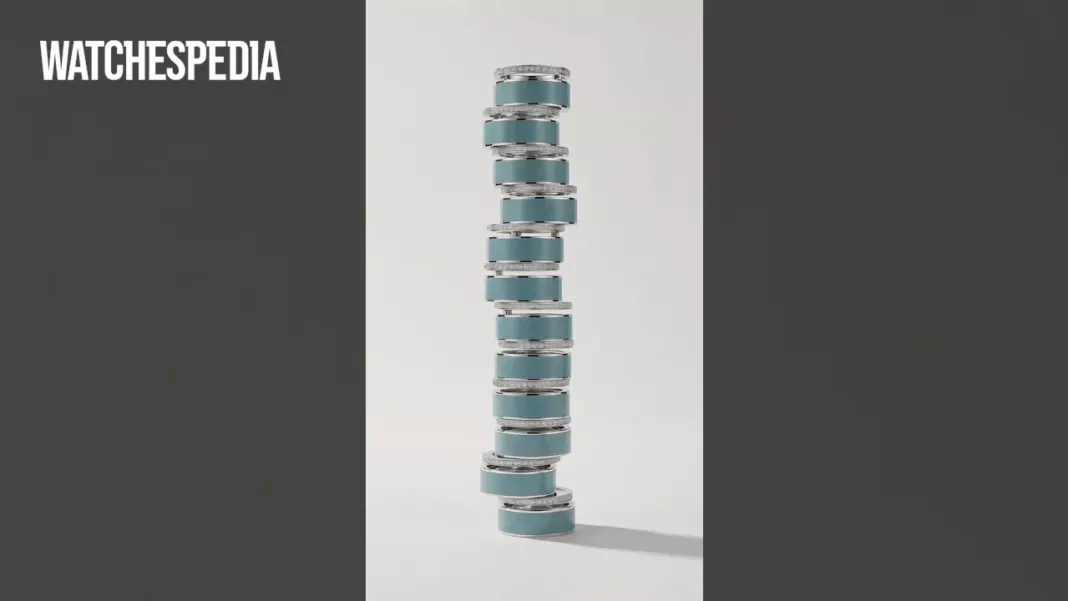
Nudo, which translates literally as “bare” or “naked” in Italian, has always carried a quality of directness. The collection strips jewellery back to its most elemental emotional function: the ability to carry feeling on the body. Over 25 years, it has become a canvas for Pomellato’s colour philosophy, building a visual vocabulary that speaks through gemstones rather than around them. The campaign film reinforces this by framing colour itself as a kind of language, one painted in light and felt rather than merely seen.
The imagery in “The Colors of Joy” leans into natural references: summer memories, thousands of shades of green, the scent of freedom found in open landscapes. These are sensory anchors that connect the jewellery to lived experience. For a collection that has always positioned itself around individuality and spontaneous emotion, grounding the anniversary campaign in memory and nature is a coherent and considered choice. The result is a campaign that feels personal rather than promotional.
Colour as Emotional Statement
Central to the campaign’s message is the idea that colour is communication, full stop. The Nudo collection is presented as a means of turning the everyday into an expressive statement of individuality, a philosophy that resonates particularly well with jewellery collectors who see their pieces as extensions of personality. This approach to colour-as-feeling, rather than colour-as-trend, gives the Nudo line a durability that purely seasonal collections rarely achieve. The full campaign film is available to view on Pomellato’s official YouTube channel.
Relevance for the Middle East Collector
In the Middle East, coloured gemstone jewellery has a deep cultural resonance. From Saudi Arabia to the UAE, fine jewellery with vivid chromatic presence has long been a marker of taste and celebration. Pomellato’s approach, emotionally direct, colour-forward, and designed for personal expression, aligns naturally with those sensibilities. The 25th anniversary of Nudo arrives at a moment when regional collectors are increasingly drawn to European fine jewellery houses with a clearly defined creative identity, rather than purely to prestige or heritage alone.
The campaign’s emphasis on joy, spontaneity, and rediscovering moments that belong only to the wearer also speaks to a broader shift in how luxury jewellery is chosen and worn across the Gulf. Pieces that carry emotional meaning, connecting their wearer to memory, nature, or personal narrative, are increasingly valued alongside, and sometimes above, purely technical craftsmanship. For Pomellato, the Nudo anniversary campaign makes that emotional proposition explicit and unapologetic.
Why It Matters
Twenty-five years of continuous relevance is a meaningful benchmark for any jewellery collection, and “The Colors of Joy” makes a compelling case for why Nudo has endured. For Middle East readers who follow fine jewellery with a collector’s eye, this campaign signals that Pomellato remains committed to colour and emotional expression as its core creative values: a house identity, not a passing trend.
Stay ahead of the latest releases. Subscribe to our newsletter for editor-curated coverage of luxury timepieces and jewellery across the Middle East.
Frequently Asked Questions
What is the Nudo collection and why is it significant to Pomellato?
Nudo is Pomellato’s iconic jewellery collection that is now celebrating its 25th anniversary. Named from the Italian word meaning ‘bare’ or ‘naked’, the collection strips jewellery back to its most elemental emotional function and has become one of the most recognisable jewellery lines in the Italian fine jewellery world, serving as a canvas for Pomellato’s distinctive colour philosophy.
What is the main message behind Pomellato’s ‘The Colors of Joy’ campaign?
The campaign positions colour not as decoration but as a form of communication and emotional statement. It frames the Nudo collection as a language of feeling that turns everyday moments into expressions of individuality, with the visual narrative drawing on nature, light, and memory to evoke thousands of shades and sensory textures.
How does Pomellato’s approach to colour differ from other luxury jewellery houses?
Pomellato positions coloured gemstones as the central emotional statement of a piece rather than as accents, building its identity on chromatic intensity and wearable character. This sets it apart from peers like BULGARI and VAN CLEEF & ARPELS, which typically pursue more classical restraint in their high jewellery designs.